Table of contents
Introduction
This is the second of three related modules:
In this module we start with normalized dataset, do a basic exploration and remove outliers, thus obtaining a proper dataset for differential expression analysis.
You can either continue the session from the previous module, or download file GSE53986_norm.gct and load it into Phantasus.
PCA Plot
Principal Component Analysis (PCA) is an essential way to asses quality of the dataset. One way to look at it is a as a linear dimension reduction method, that allows to go from 10000-dimension space (by a number of genes) to something smaller, like two or three dimensions, which can be displayed on a plane. Importantly, PCA assumes Gaussian-distributed noise, so it should be run on log-scaled gene expression values.
PCA plot can be done using Tools/Plots/PCA Plot menu. Each point on a PCA plot represents one sample. You can customize color, size and labels of points on the chart using values from the annotation. For example one can set the color to come from treatment annotation.
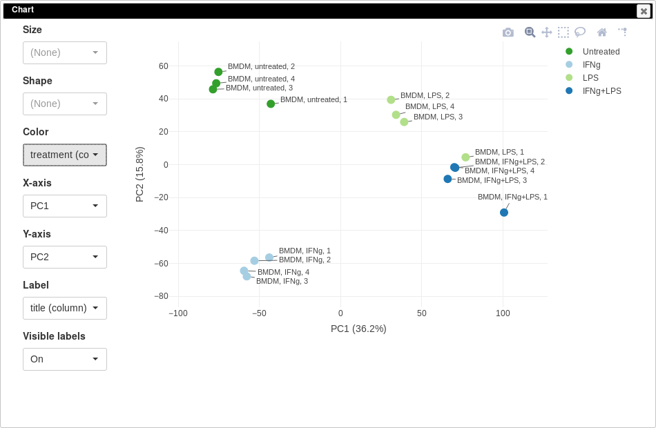
From this plot we can see that our samples more or less group together, which is good, meaning that the samples from the same condition correlate well with each other and no so much with other conditions. However, there are first replicates which seems to be outliers in three of four conditions.
Notable property of PCA, as opposed to other dimension reduction techniques like MDS or t-SNE, is that it is linear and thus principle components are interpretable. In our case we can see that PC1 corresponds to LPS treatment (all LPS-treated samples are on the right side, and non-LPS are on the left, note that PCA can’t distinguish positive from negative direction, so in your case the sides can be swapped) and PC2 corresponds to IFNg treatment. Sometimes, sample labels can be accidentally mixed up and PCA analysis can be used to catch this.
It is also can be useful too look at percent of variation explained by each component. For example, in our case LPS treatment seems to have bigger effect compared to IFNg treatment.
K-means clustering
Another useful dataset exploration tool is k-means clustering. It is a general clustering method, that can group genes into k clusters based on their correlation (technically, Euclidean distance for z-score expression values is used).
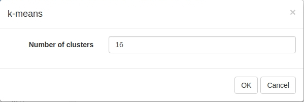
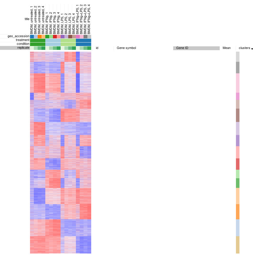
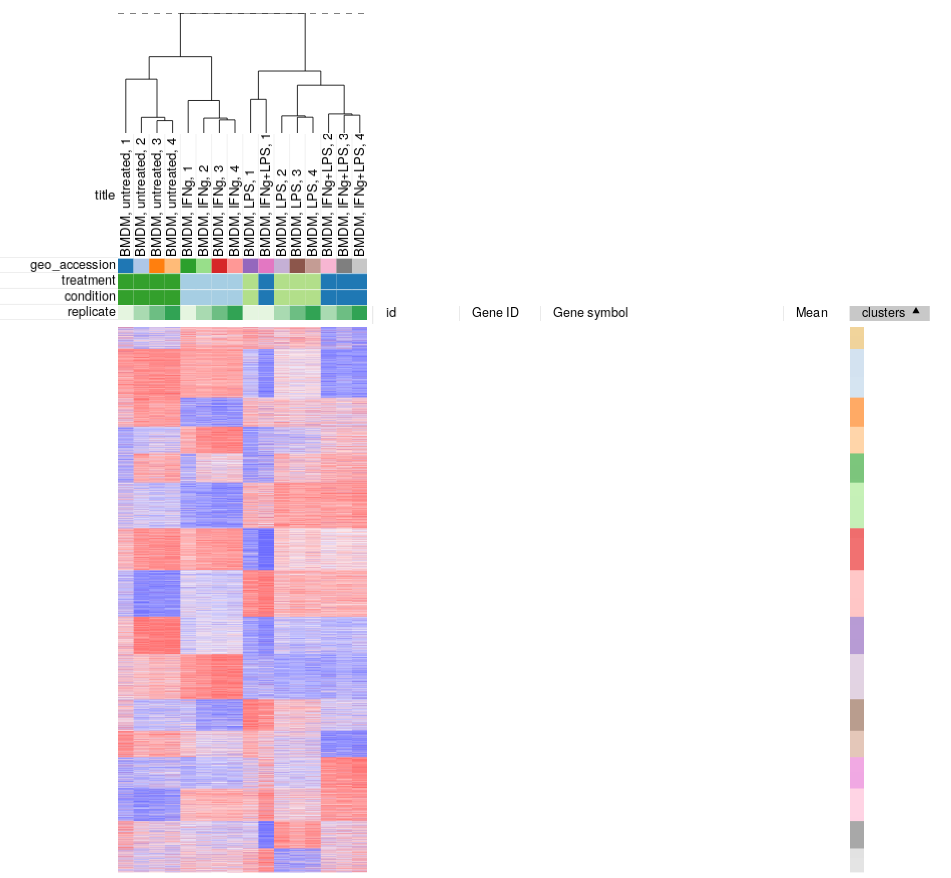
To apply k-means clusting use Tools/Clustering/k-means menu. There is no definite answer on the best value of k to be used, but the general heuristic is that the number of clusters scales with the number of biological conditions in the dataset. For the example dataset we will be clustering into 16 cluster:
Afterwards, rows can be sorted by clusters column. By using menu View/Fit to window one can get a “bird’s-eye view” on the dataset, which usually helps understanding the structure of the dataset. In particular, it easy to see that the first replicates in each of the four conditions looks quite different from the other samples in the group.
Hierarchical clustering
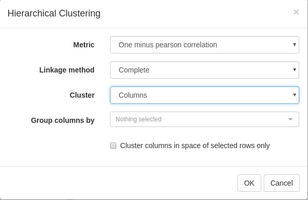
Similarly, clustering can applied to samples to better display inter- and intra- group correlations. Hierarchical clustering is perfect for such analysis. Briefly it works by starting from a set of cluster consisting of individual samples, and on each step two closest clusters are joined, until a single cluster is left.
Let us use Tool/Hierarchical clustering menu to apply hierarchical clustering. There is a number of parameters, but they can be left as is.
A dendrogram showing how clusters were joins is added on top of the heatmap. We can again see that the first replicates are clustering outside of their groups.
Filtering outliers
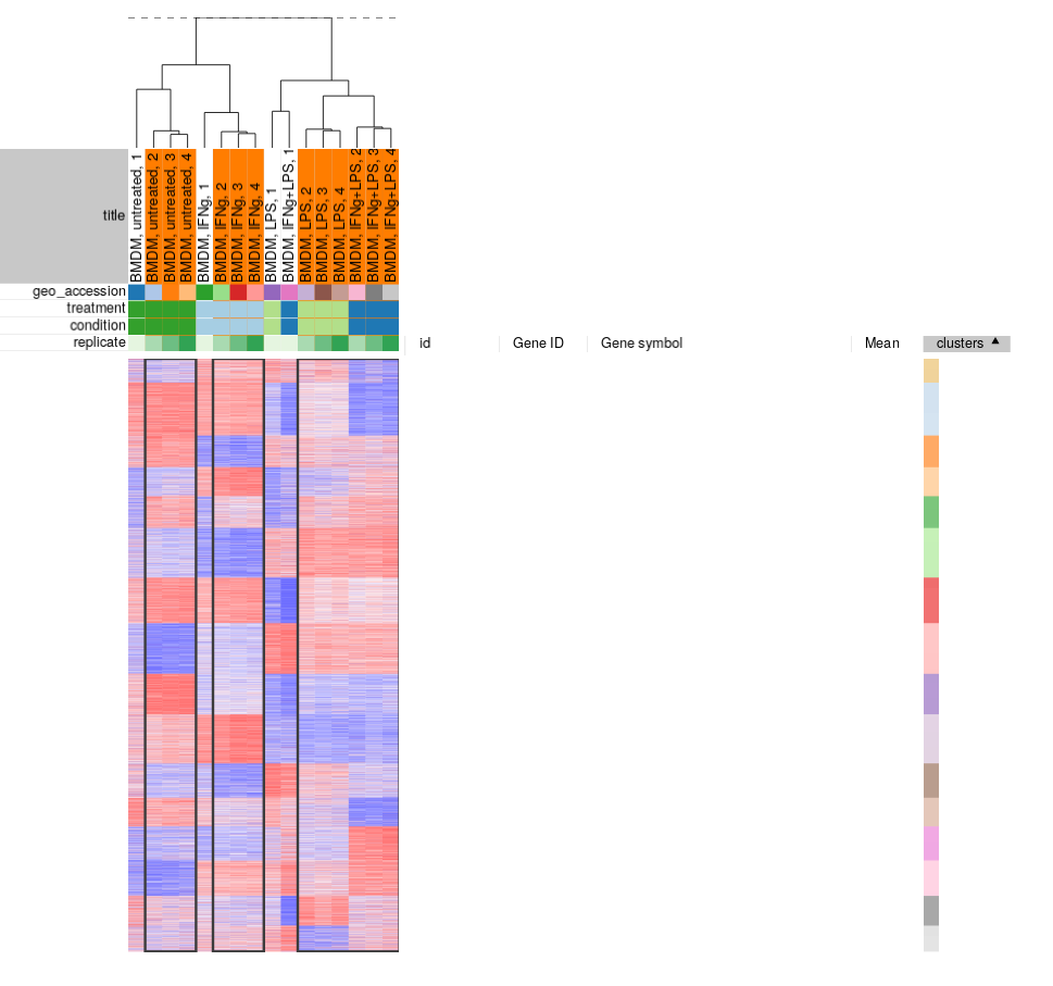
From our exploration we can conclude that while overall the dataset looks good and samples in the groups correlate well with each other, there are outliers which can be removed. You can select the good samples and extract them into another heatmap (by clicking Tools/New Heat Map or pressing Ctrl+X).
Finally, let us save the filtered dataset as “GSE53986filtered.gct” using _File/Save Dataset menu. For the reference, the result should be similar to the following file: GSE53986_filtered.gct.
There is a couple of points that should be kept in mind about filtering outliers:
- There is no definite way to distinguish outliers from biological variation, so one has to be cautious about them for the process not to turn into cherry-picking. For this particular dataset we can see that, for example, untreated 1 sample is quite different from pretty tight group of other untreated samples. Moreover, the fact that all outliers are the first replicates indicate that there was a systematic batch problem, probably related to plate layout during sample preparation step.
- Sometimes outliers can be very different from other samples. In this case the analysis has to be redone from scratch after removing the sample. Otherwise, during quantile normalization step the bad samples were taken into account as well, thus making data in the good samples more noisy.
Summary
To summarize this and the previous module:
- For the most types of analysis gene expression data should be log-scaled. Sometimes the data can be already log-scaled, some time it is not. It is important to check this and make it log-scale if necessary.
- Gene expression data should be normalized, so that the samples can be properly compared. One of the most straightforward way to do it is quantile normalization.
- The data has to be quality checked. For this you can look at marker genes, do a PCA analysis and clustering.